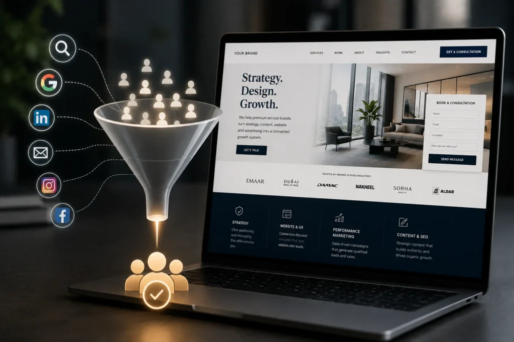
A website can attract traffic and still fail.
Many businesses invest in ads, SEO, social media and content to bring people to their website. But once visitors arrive, they leave without taking action. They do not submit a form. They do not book a consultation. They do not download a resource. They do not return.
This is often not a traffic problem.
It is a conversion problem.
A website should not only exist as a digital profile. It should work as a commercial system. It should help users understand the brand, trust the business, explore the offer, answer key questions and take the next logical step.
Design matters, but conversion is not created by design alone. It is created by clarity, credibility, structure, relevance and trust.
A conversion-focused website does not pressure people. It guides them.
The Website Is Part of the Growth System
Many businesses treat the website as a one-time design project.
They build it, launch it and then shift attention to ads or social media. But the website is not separate from marketing. It is the center of the digital growth system.
Paid ads often send users to the website. SEO depends on website structure and content. Social media drives profile visitors to the website for deeper information. Email campaigns need landing pages. Sales teams use website pages as proof. Prospects evaluate the business through the website before they speak to anyone.
This means the website affects almost every part of growth.
If the website is unclear, every channel becomes less efficient. If the website is strong, every channel performs better.
A business should not ask only:
“How does our website look?”
It should ask:
“Does our website help people trust us and take action?”
First Impression: Clarity Before Beauty
A user should understand the business quickly.
Within the first few seconds, the homepage should answer:
What does this business do?
Who is it for?
What problem does it solve?
Why should the visitor continue?
Many websites fail this first test. They use broad phrases like “we create solutions,” “we help brands grow,” or “your trusted partner.” These statements may sound professional, but they do not create enough clarity.
A strong hero section should communicate a clear promise.
It should not try to say everything. It should create immediate relevance.
For example, instead of saying:
“We provide innovative digital solutions.”
A stronger message may say:
“We help premium service brands turn strategy, website, content and advertising into a connected growth system.”
The second version is more specific. It gives the user a reason to stay.
Clarity is not the opposite of creativity. It is the foundation of effective creativity.
Credibility Is a Conversion Factor
Users do not convert only because they understand the offer. They convert when they feel enough trust.
Website credibility is created through many small signals.
A credible website shows that there are real people, a real organization and a clear service structure behind the brand. It provides enough information for users to evaluate the business. It looks professional. It avoids errors. It includes relevant proof. It makes contact easy.
Credibility signals may include:
Case studies
Testimonials
Client logos
Team information
Clear contact details
Process explanation
Professional design
Updated content
Portfolio examples
Relevant certifications
Strong service pages
Consistent tone of voice
These signals reduce doubt.
For high-value services, credibility is especially important. A visitor may not submit an inquiry if the website feels vague, outdated or incomplete. They may like the brand visually, but still hesitate because they cannot evaluate its reliability.
Trust is not only emotional. It is structural.
A website should be designed to make trust easier.
Service Pages Should Explain Value, Not Only List Services
Many service pages are too shallow.
They say the company offers branding, social media, website design, SEO, advertising or content creation, but they do not explain what those services actually solve.
A strong service page should answer:
What problem does this service solve?
Who needs it?
When does a business need it?
What is included?
How does the process work?
What outcomes can it support?
What makes the approach different?
What should the user do next?
This matters because users are often not experts. They may know they need help, but not exactly which service they need. The website should educate them enough to move forward.
For example, a business may think it needs ads, but the real issue may be a weak landing page. Another may request social media management, but the deeper problem may be unclear positioning. A good service page helps users understand the relationship between problem and solution.
This improves lead quality.
A better-informed visitor is more likely to become a qualified inquiry.
Content Should Support Decision-Making
A website should include content for different stages of the buyer journey.
Some users are not ready to contact the business. They are still researching. They want to understand their problem. They want to compare options. They want to avoid mistakes. They want to know what good looks like.
Strategic blog content, guides and insight articles help the website support these users.
For example, a marketing boutique might publish articles such as:
How to choose the right digital marketing agency
Why posting more is not a social media strategy
What makes a website convert
How SEO, AEO and GEO are changing search
Why brand positioning should come before advertising
How content builds trust before sales
These articles attract search traffic, but they also do something more important: they help prospects think.
Content turns the website into a decision-support system.
When users read useful content, they begin to trust the brand’s expertise before the first conversation.
Conversion Paths Should Match Intent
Not every visitor is ready for the same action.
Some are ready to book a consultation. Some want to read more. Some want to see work examples. Some want to understand the process. Some are comparing providers. Some are still discovering the problem.
A conversion-focused website should provide different paths for different levels of intent.
High-intent users may need a clear “Book a Consultation” or “Contact Us” CTA.
Medium-intent users may need case studies, service pages or process explanations.
Low-intent users may need educational content, guides or newsletter sign-ups.
If every page pushes the same hard CTA, the website may lose users who are interested but not ready. If there is no clear CTA, the website may lose users who are ready but uncertain what to do.
Conversion design is about offering the right next step.
Landing Pages Need a Single Clear Job
Campaign landing pages should not behave like general website pages.
A landing page has one main purpose: to convert a specific audience from a specific campaign into a specific action.
That means the page must be focused.
A strong landing page should include:
A clear headline
A relevant offer
Audience-specific pain points
Benefit-led messaging
Proof or credibility signals
Simple structure
Strong visual hierarchy
Low-friction form
Clear CTA
Mobile optimization
The page should remove distractions. It should not force users to search for the message. It should continue the promise made in the ad.
If an ad speaks about lead generation, the landing page should explain how the service improves lead quality. If an ad promotes a website service, the landing page should show why the website affects credibility, SEO and conversion. If an ad promotes brand strategy, the page should explain how positioning improves marketing performance.
Message match matters.
A campaign fails when the ad, page and offer are disconnected.
SEO and Conversion Should Work Together
Some websites are built for SEO but not conversion. Others are built for design but not search. Both approaches are incomplete.
A strong website should be discoverable and persuasive.
SEO brings qualified users to the site. Conversion strategy helps those users take the next step. Content structure helps both search engines and users understand the page. Internal links guide visitors from articles to services. Service pages target commercial intent. Blog content builds topical authority. Case studies provide proof.
SEO should not be treated as something added after design. It should be part of the website strategy from the beginning.
Important pages should have:
Clear headings
Useful content depth
Relevant keywords
Internal links
Fast loading
Mobile usability
Descriptive metadata
Strong page hierarchy
Helpful FAQs
Conversion-focused CTAs
The best websites do not choose between SEO and conversion.
They combine both.
Analytics Should Reveal Friction
A conversion-focused website is never finished.
It should be measured and improved over time.
Analytics can show where users come from, which pages they visit, how long they stay, where they leave and which actions they take. Heatmaps, form tracking, scroll depth, event tracking and conversion reports can reveal friction.
A business should review:
Which pages generate inquiries?
Which traffic sources convert best?
Where do users drop off?
Which CTAs get clicks?
Which service pages underperform?
Which blog articles assist conversions?
Are forms too long?
Is mobile performance weak?
Are users reaching proof pages?
Without measurement, website improvement becomes guesswork.
A professional website strategy treats the site as a living asset.
Common Website Mistakes That Reduce Conversion
Several issues commonly reduce website performance.
The first is vague messaging. If users cannot understand the value quickly, they leave.
The second is weak proof. Claims without evidence do not build trust.
The third is poor structure. If users cannot find what they need, they lose interest.
The fourth is thin service pages. If services are not explained properly, users cannot evaluate fit.
The fifth is generic content. If the website sounds like every competitor, it becomes forgettable.
The sixth is weak mobile experience. Many users browse on mobile before deciding whether to engage.
The seventh is unclear CTAs. If users do not know what to do next, they may do nothing.
The eighth is slow performance. A slow website damages both experience and confidence.
Most conversion problems are not caused by one issue. They are caused by multiple small frictions.
Website Conversion Checklist
A business should evaluate its website using these questions:
Can visitors understand the brand within five seconds?
Does the homepage communicate a clear value proposition?
Do service pages explain problems, process and outcomes?
Is there enough proof?
Are CTAs clear and relevant?
Is the website mobile-friendly?
Does the blog support the buyer journey?
Are internal links guiding users properly?
Are landing pages aligned with campaigns?
Is SEO built into the structure?
Are forms easy to complete?
Is performance being measured?
If the answer to several of these questions is no, the website may look good but still underperform.
Conclusion: Traffic Is Only Valuable When the Website Can Convert It
Traffic alone does not create growth.
A business can increase ad spend, publish more content and improve rankings, but if the website does not build trust or guide users, the growth system will leak.
A conversion-focused website connects strategy, credibility, content, UX, SEO and analytics. It helps users understand the brand, believe in the value and take the next step.
The strongest websites are not just beautiful.
They are useful.
They are credible.
They are clear.
They are structured.
They are measurable.
They are built around the user’s decision.
A website should not only represent the brand.
It should help the business grow.